Modern cars are more than just a means of transport. When riding a car, modern consumers now desire an experience beyond just driving; that is, User Experience (UX) has emerged as a keyword in automotive development. Automotive UX encompasses every little experience we undergo while on a ride―what is the interior like? How does the material feel to the skin? Does NVH (Noise, Vibration, Harshness) feel acceptable? Is the infotainment system intuitive and useful?-and it can sway the image of not just the specific model of the car but also the brand itself.
Car infotainment systems are thus turning into one of several important features being highlighted in the transition phase to the future of mobility. This is particularly so in light of the expected developments in self-driving technology, which will make the infotainment system more than just a navigation and media playback device but a comprehensive platform for a variety of contents.
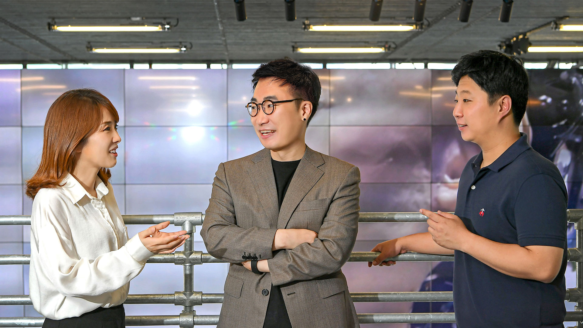
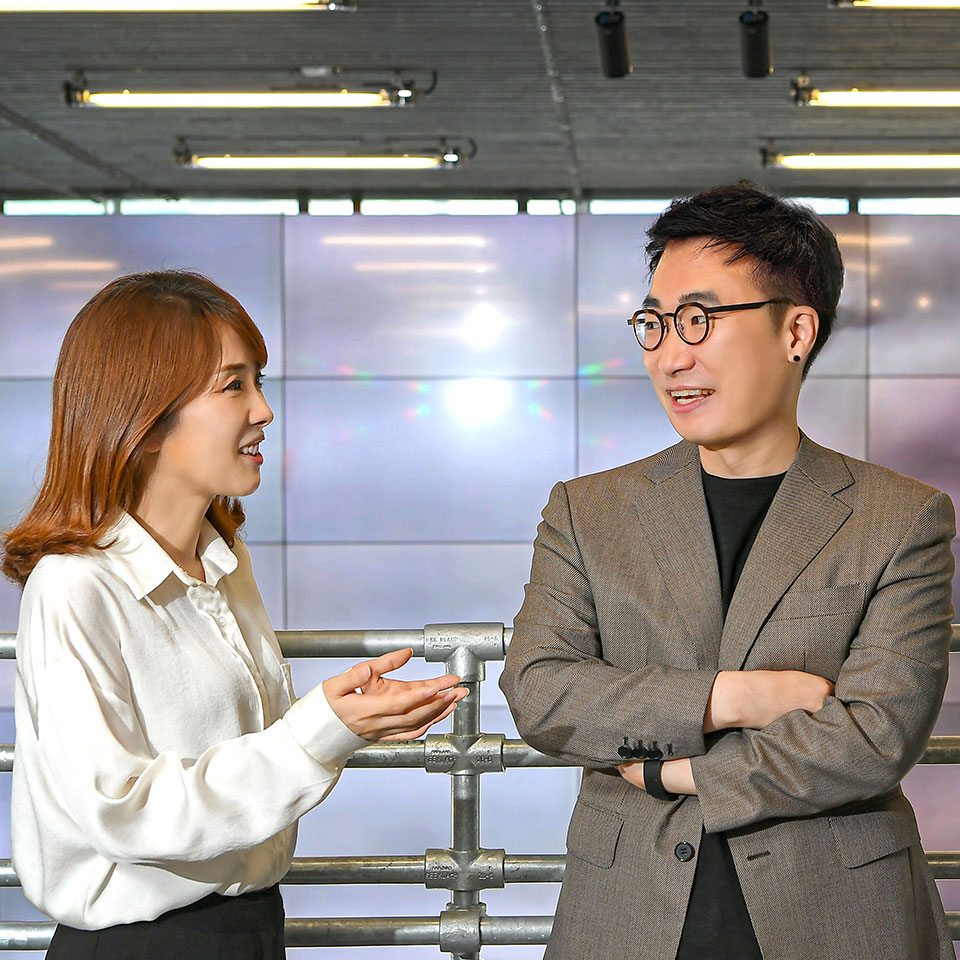
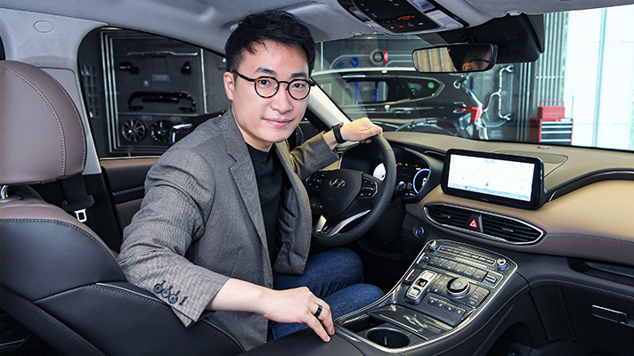
Hyundai Motor Group is preparing for that new era by gradually expanding the role of the infotainment system. We met the developers of the system’s Cluster (Instrument Cluster), AVNT (Audio, Video, Navigation, Telematics system), and Graphic User Interface (GUI) to inquire about the processes by which the Infotainment System UX of Hyundai/Kia/Genesis is developed.
Q. To start, could you introduce yourselves and your respective work?
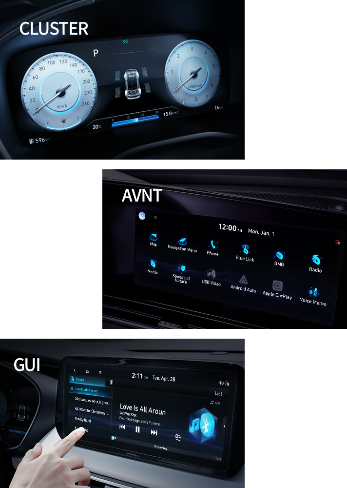
Shin Wook-Jin, Senior Research Engineer | I develop the UX for the all-important cluster, a digital dashboard that displays status information on the car’s many safety and convenience features. Particularly important is the information that pertains to driving, like the vehicle speed, driving mode, fuel economy and amount of fuel, etc. The goal of my work is to find an optimized layout and delivery for this information so that the driver finds it readily accessible.
Choi Hye-Jin, Senior Research Engineer | I develop the UX for the AVNT. I majored in psychology and then spent a few years in the mobile UX industry. My main work is in designing and planning the display system, from its composition to menu trees to user interface. For example, if a user selects a menu icon-phone, navigation, radio-what should be the next screen like, so that the user finds it intuitive and easy-to-use? Contemplating this and amending the UX to this end is the crux of my work.
Kim Young-Hoon, Senior Research Engineer | Like Hye-jin, I also moved from the mobile UX industry to the automotive industry. In the team, I am responsible for developing and managing the GUI, which is essentially an overall design concept that includes the graphic layout and color scheme as well as icon and animation design. My first project was developing the Dynamic Theme feature for the cluster, which changes the display according to the time of day and weather.
Q. It feels like modern infotainment systems have essentially become smart IT devices in function and design―in light of this evolution, what is your definition of a “easy-to-use” automotive infotainment system?
Choi Hye-Jin | Much of the information that goes on the cluster-speed, amount of fuel, autonomous driving status-have implications on safety. Likewise, safety is priority for AVNT, which will often be used while the driver is in the middle of driving. This concern for safety is what distinguishes automotive UX from mobile UX. To this end, screens should be understood at a glance, and the functions should be readily accessible. This is why the infotainment UX always has just a small number of icons on a screen that is far larger than the smartphone’s.
The concern for safety also manifests in subtle ways-for example, the UX changes depending on whether the user is in a stopped car or in the middle of driving. While in a stopped car, users will be able to navigate through smaller touch areas and somewhat complicated layouts, but it would be dangerous to ask them to do the same in a moving car. So during then, we give them larger touch areas and bigger fonts. Another important thing is consistency, because we cannot expect drivers of all age range to adapt quickly to the new UX. We try to insert new functions in a way that shows continuity to the way that older and familiar functions were used.

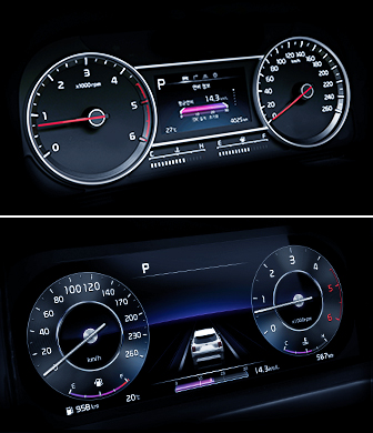
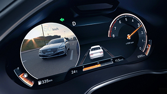
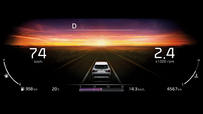
Shin Wook-Jin | The cluster is evolving from analog to digital, which brings changes to the way I do my work as well. Whereas the analog cluster conveyed a limited set of information across set locations of the dash, the digital cluster can convey a multitude of information in a very flexible manner. In the past, for example, the vehicle speed and engine RPMs were noted by rotating needles around circular gauges. Now digital numbers in various colors have taken their positions. But of course, given the scarcity of space and concerns of safety, the digital dash cannot simultaneously display all information either. Categorizing the information and defining their relative priorities is therefore important.
Also important is displaying information that is relevant to the status of the driver and the vehicle. Up to now, the ‘relevant’ information was mostly just speed, gear, and fuel amount. But with the development of autonomous driving technology, we’re seeing an increased importance in displaying information about the vehicle’s self-driving status. Nowadays lots of features exist that, for convenience’s sake, automatically change the vehicle settings without asking for the driver’s permission. But the driver needs to be aware of these changes-especially the ones that concern his or her safety. Until self-driving cars reach complete autonomy, at least, displaying self-driving status information will be an important role played by infotainment systems. Functionality without transparency fails to build the consumer trust, after all.
Kim Young-Hoon | Because drivers use many of the infotainment system’s functions while driving, the most important aspect of the GUI is discernibility: how easily can the driver notice and use the function? Smartphones function by downloading external apps, so there is little continuity in the color scheme across icons of different apps. But all icons in a car infotainment system are designed to have the same color scheme and style while differing only in shapes, making them appear more organized and more easily distinguishable.
The next most important aspect is aesthetics―how appealing is the visual design to the user? For the home screen, which is essentially the vehicle’s first impression, we try to instill in the image the brand’s core identity; for the screens that embody important functions, though, discernibility and interface take priority.
Q. What are some characteristics of Hyundai Motor Group’s latest car infotainment system? Any changes from the previous version?
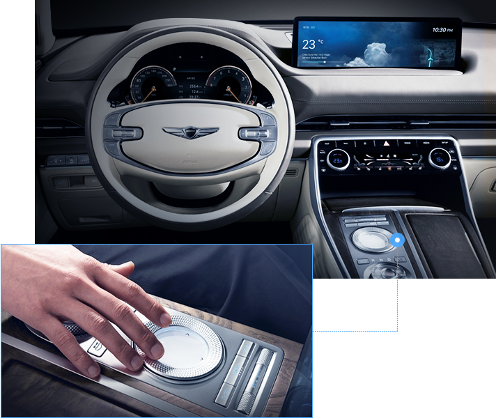
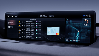
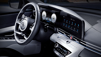
Choi Hye-Jin | The group’s navigation platforms can be divided into the Standard 5W-gen (Hyundai/Kia) and the Advanced 6th-gen (Genesis). The two platforms have the same basic structure but differ in whether the integrated controller (mounted on the Genesis GV80 for the first time) is there. Unlike the older version, the new platform has a wider display with a right-side split-screen that provides such various information as map, weather, and connected-car service info.
Shin Wook-Jin | Most recently released models (albeit depending on the trim) come with the fullscreen digital cluster with a large-screen display or the analog cluster with a small-screen display. Regardless of the difference in screen size, though, the main information provided by the clusters is the same, so both the digital and analog clusters are based on the same UI. In a sense, the full cluster is the enhanced version of the analog one that provides the same information in a more aesthetically and experientially appealing layout or graphic.
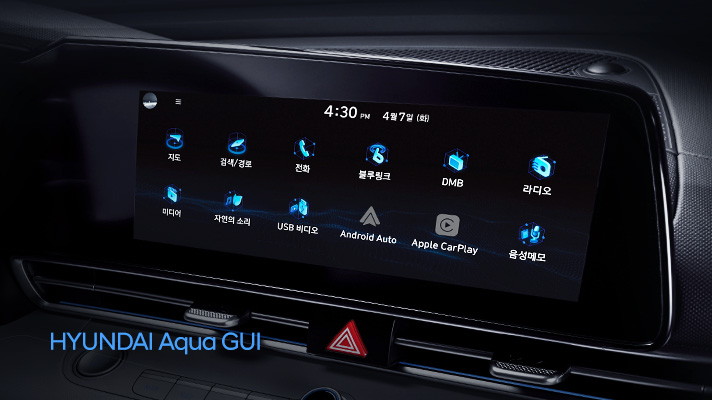
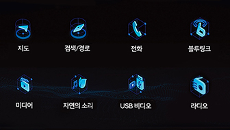
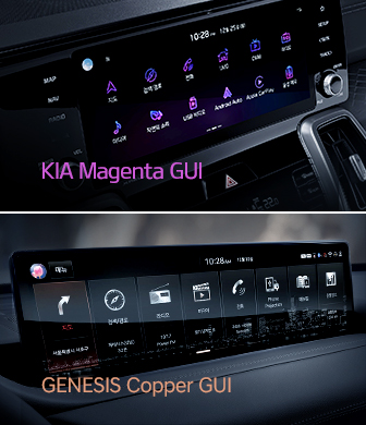
Kim Young-Hoon | Even in the same platform, the GUI was designed to highlight the different identities of the brands within the group. It was also built to maintain a consistent user experience across the cluster and the AVNT. Hyundai Motor Company’s Aqua GUI was inspired by the brand’s signature blue color-of the many hues of blue, the deep-sea blue, or aqua blue, was chosen as the main scheme for the GUI. In addition, the icons were drawn in an isometric design (a technique for drawing 3D objects in 2D), which reflects the brand’s futuristic aspirations. The cluster and the AVNT received the same cube-icon theme for consistency.
Kia Motors’s Magenta GUI, inspired by neon lights, is reflective of the brand’s dynamic and intense youthful image; as for Genesis, we wanted a scheme that reflected the brand’s understated, sophisticated elegance-which led to the creation of the Genesis Copper GUI, the winner of the globally influential design accolade Red Dot Award. The awarding committee dubbed it as providing both optimal discernibility and intuitive interface while being aesthetically elegant.
Q. Modern infotainment systems are predominantly a combination of horizontal or vertical large-screen AVNT and a full digital cluster with novel compositions. The GUI reminds one of that for a Smart IT device. How is Hyundai Motor Group reacting to these perceived trends?
Choi Hye-Jin | Tesla and Volvo are noteworthy competitors who use large-screen vertical AVNTs. These systems minimize the traditional physical buttons, bringing them into the touchscreen. While the interior becomes chic and minimal as a result, replacing all physical buttons with touch functions makes it difficult for drivers to operate those functions while driving-especially at high speeds.
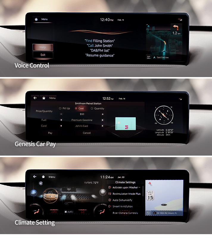
The horizontal displays, on the other hand, allow an array of familiar physical buttons to be placed around the AVNT. Because the buttons give off a firm feel upon being pressed, the driver is more aware of having successfully made the adjustment. We also have brought in a server-type voice recognition function to make the UX more convenient.
Shin Wook-Jin | Compared to analog clusters, full digital clusters have an advantage in being free to display a variety of information, so we’re seeking ways to innovate the UX by employing different themes and compositions. But the traditional circular gauges with the speedometer and the tachometer have the benefit of being intuitive and familiar. So as to minimize the initial user discomfort, we’re trying to “bring the digital into the analog,” so to speak, where we digitally render analog style clusters. But we see this step as a foundation, or a transition, to more radical and innovative departures from the tradition. More interesting and novel Cluster UX is coming soon.
Q. For the older generations unaccustomed to Smart IT devices, the latest infotainment systems might represent a hurdle.
Choi Hye-Jin | This is true. The responsiveness to technology is divergent across generations, so going cutting-edge cannot be the only priority. The process should take time and be carefully deliberated. It took people some time to get accustomed to smartphones’ touch screen function, but now everyone uses it, regardless of the age group. In that light, going digital is an unstoppable trend, but we always try to find some continuity in the way we design the new UX to more naturally extend the old. We also often just keep the old function alive next to the new.
For instance, we supplement the voice recognition function with an assortment of sample orders displayed as text in the AVNT screen. We also try to add assistance graphics to help the users through complicated functions. Our common goal, designers and engineers alike, has always been to provide a concise and intuitive UX that manages to feel fresh and appealing. We’ll continue to work toward this goal.
Kim Young-Hoon | Full digital clusters are useful in giving off that fresh feel Hye-jin was talking about―they can render lavish, eye catching graphics in ways that analog clusters simply could not. But just as the driver must select the driving mode himself, the graphics can only change when the driver himself operates the functions. After all, indiscriminate use of lavish animations can be a distraction, which hinders safety.
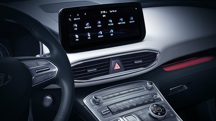
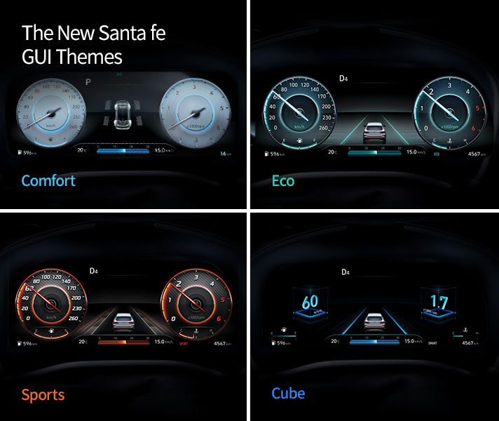
The recently released new Santa Fe’s full digital cluster changes its design depending on the driving mode setting. The designs can be divided into the Classic Theme (Comfort, Eco, and Sports modes) and the Cube Theme with the Aqua GUI. Inspired by the indirect lighting in a building interior, the Classic Theme was designed to give off a feeling that the gauge needles were shadowed by a tailing beam of light. The Comfort Mode applies a daring white background to the circular gauges, making the cluster appear sedate and serene while still being discernable; the Sports Mode incorporates carbon fiber texture for added dynamism; and the Eco Mode alludes to refreshing, translucent glass that befits its eco-friendly identity. The Cube Theme, on the other hand, focuses more on the consistency between the AVNT and the cluster. We applied various cube motion graphics onto the icons, also dependent on the driving/stopped status.
Q. Mobile devices ensure that the users enjoy the latest developments through constant updates. Can infotainment systems be similarly updated, honing the system toward perfection?
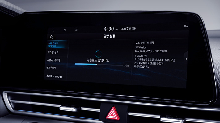
Choi Hye-Jin | The updates have already been there―Hyundai Motor Group has consistently released software updates that not only update map data but also the UX. More recently, we began offering the Over-The-Air (OTA) wireless navigation updates as well, which adds to the user convenience. Updating, actually, is one of our most essential tasks: discernibility and easier-to-use interface are not goals with concrete target thresholds. There always is more to do, and so improving the software and updating the UX is what hones the system to its perfection.
Q. Some recent car models have shown an attempt to integrate the cluster and AVNT into one long display. What will be the future implication of this development?
Shin Wook-Jin | The cluster deals with safety, and the AVNT deals with convenience. They differ significantly both in the information they deliver and in their essential function. In this vein, throwing in, say, navigation info into the cluster might appear “fresh” and unique but ultimately wouldn’t be pragmatic.
But when fully autonomous cars arrive, things might change. Drivers won’t be doing much in the car, and they will want to explore many different activities while in the vehicle, and then blurring the boundary between the cluster and the AVNT might make sense. In that world, it wouldn’t be strange to see media-related information in the cluster, because the driver need not be concerned about road safety. Our next-generation infotainment system is being developed with this in mind: with a more integrated design, the system will have a variety of information transmitted between the cluster and the AVNT.
Kim Young-Hoon | With the screens becoming larger and larger on infotainment systems, many contents are being developed that seek to take advantage of the in-car audience. Some examples: the New Santa Fe’s Cube Theme replaces the speedometer and the tachometer with 3D cube graphics that emphasize the large screen; Kia Sorento’s Dynamic Theme shows the real-time weather via the cluster graphic. The latter was inspired by some mobile devices that changed their background wallpapers depending on the weather.
The leftmost screen on the AVNT in the 5W-gen navigation platform gives off a feel of a standby screen on a computer. The advanced version shifts the background to match the weather as well. The media playback screen uses the album cover image in the streaming service’s database as the screen background, offering a more colorful visual experience. As seen, our infotainment systems have been evolving, and will continue to develop in a way that provides not only access to more diverse content but also an optimal and appealing user experience.